ReUp Education
Warming up the story
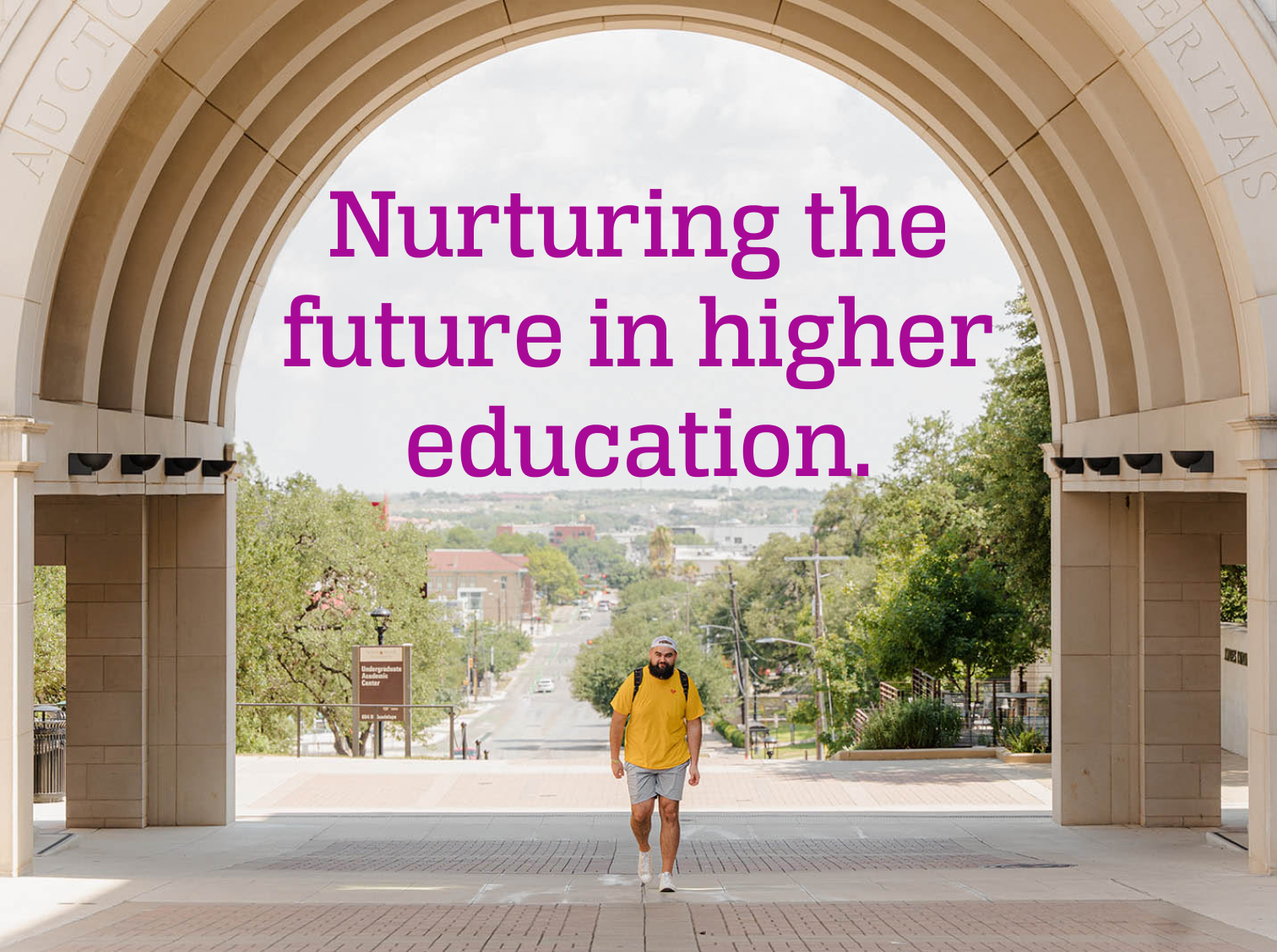
ReUp is transforming higher education. Working with students, universities, and state governments they are creating a new landscape that elevates the experience of adult students to parity with traditional high-school grads. They have a complex, mixed audience and were operating with a legacy identity that inspired no one.
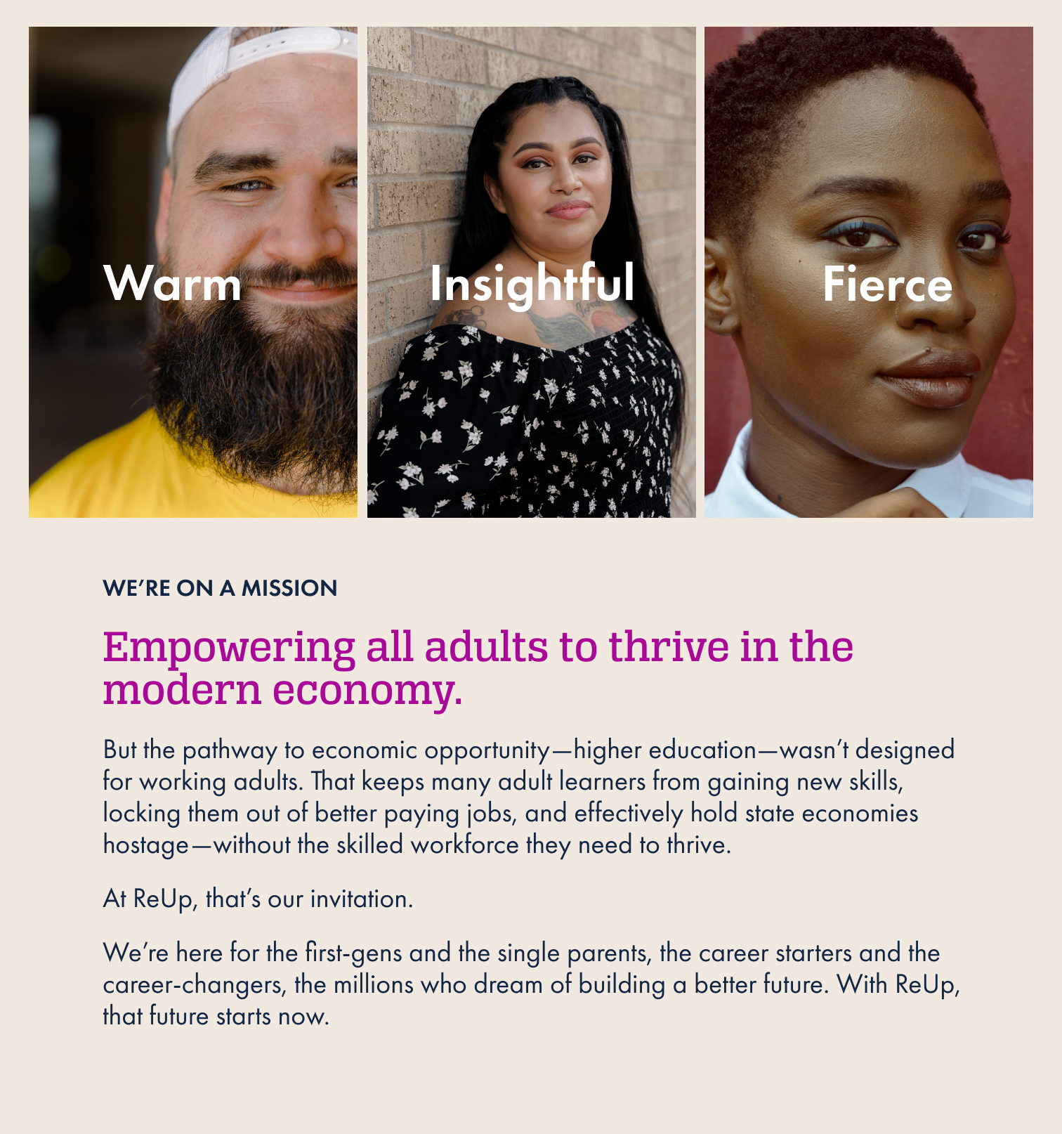
I worked with ReUp’s leadership, coaching, and sales teams to discover and articulate the difference they are trying to make—in millions of individual lives and on a grand, national scale. With an impactful mission and brand positioning identified we crafted a new creative identity that could flex to meet the needs of reaching adult learners, university administrators, and elected government officials with equal effect.
Logo
ReUp’s existing logo just needed small tweaks to rise to the new identity. We beefed up the letter forms to give the logo more confidence and decided to go bold with color to help it stand out in a sea of academic sameness.
Voice
Summed up in a single phrase: Change agents driven by possibility.
Visual language
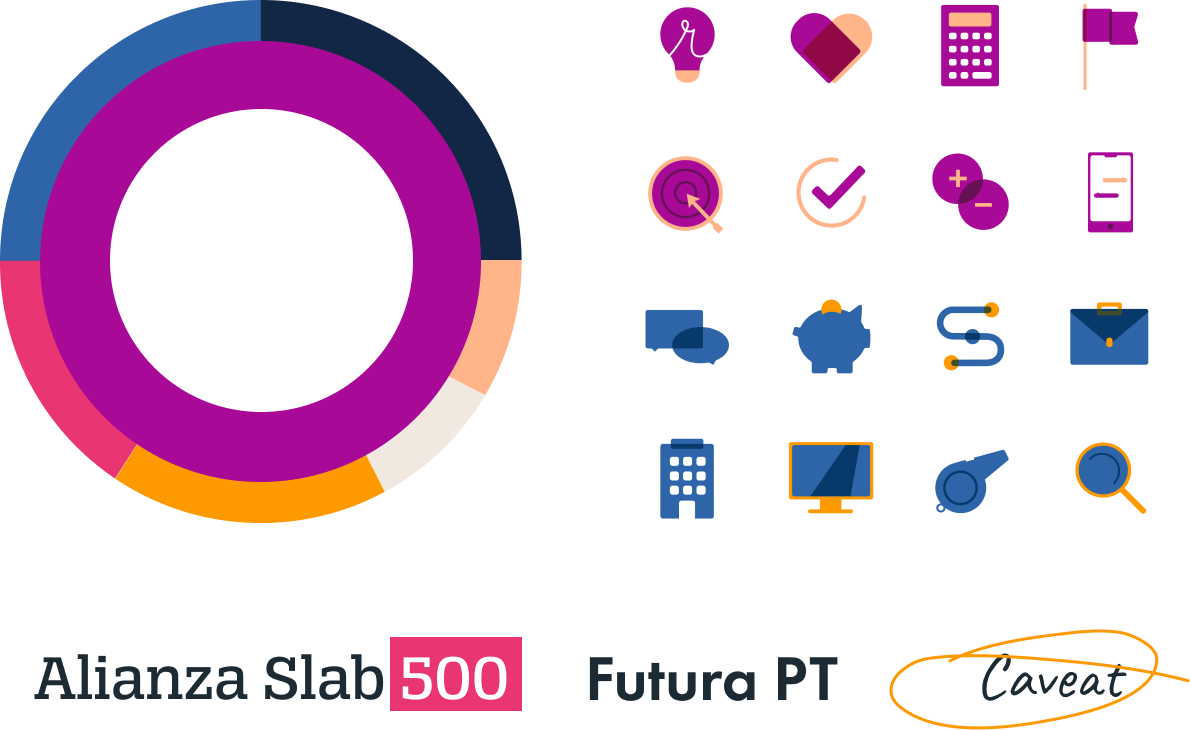
The palette exemplifies our voice, in color. Rich, bold hues—unconventional in higher ed—make communications stand out. Icons are inviting, and the suite of font selections can mix and match to accommodate all audiences equally.
In the wild
Homepage
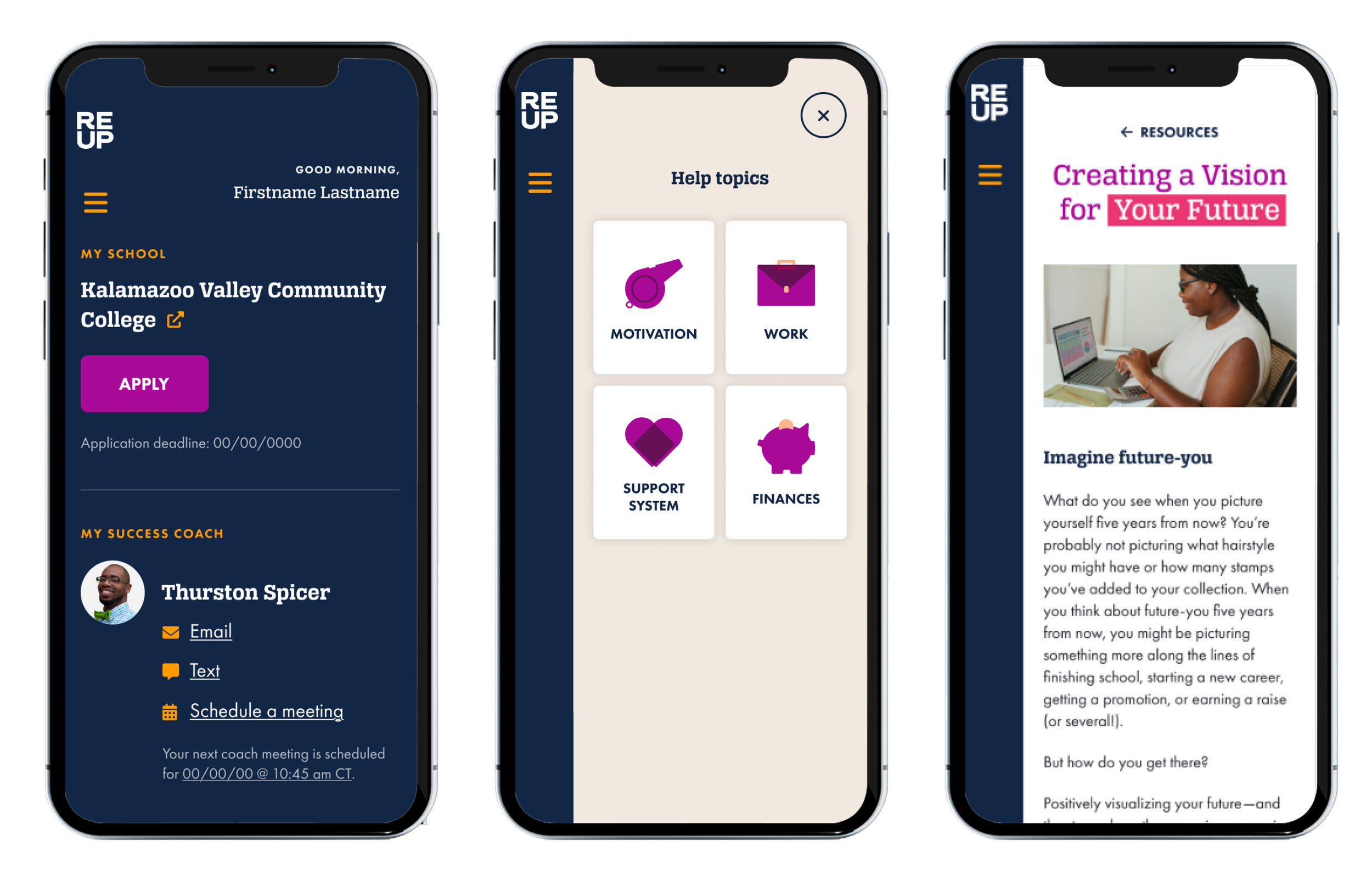
Learner dashboard
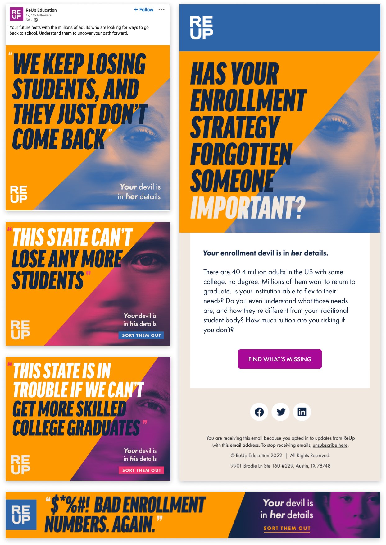
B2B Campaign

